Thresh
The point of change
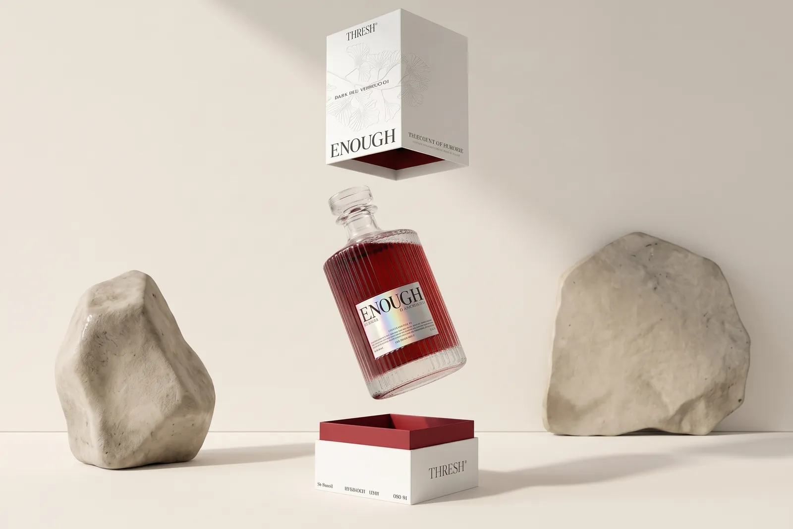
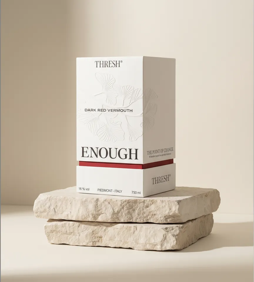
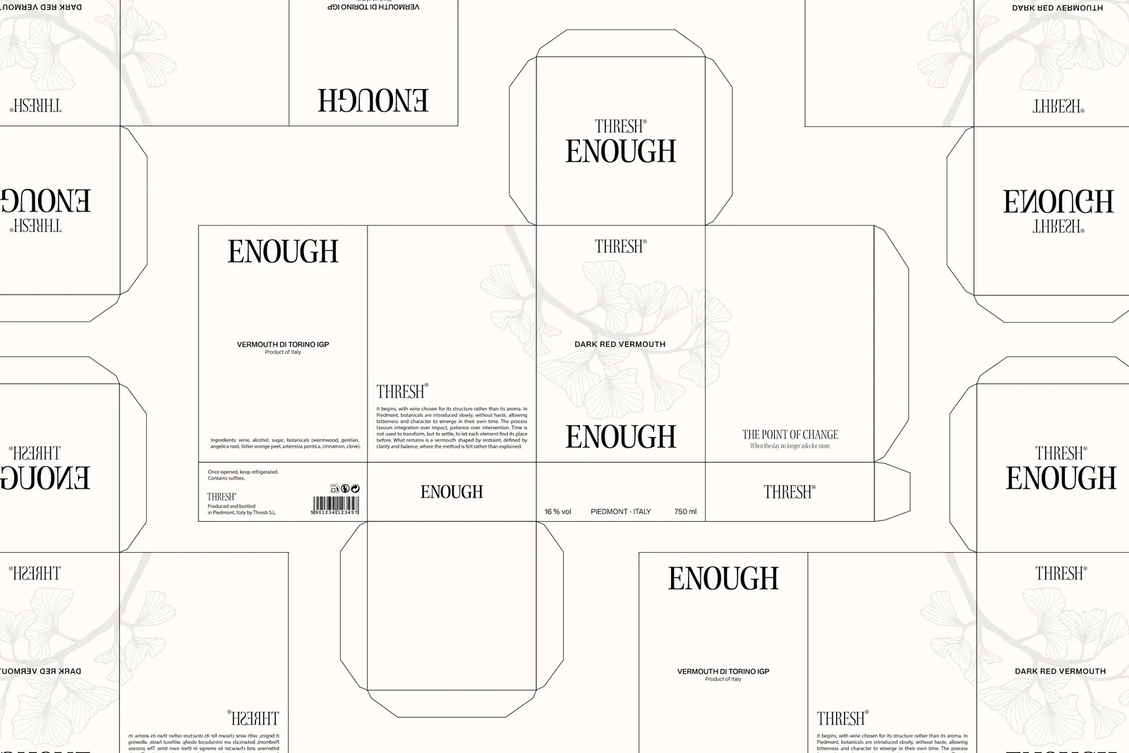
THRESH is a branding and packaging project for a vermouth brand built around the concept of the cut: the conscious moment when
you decide to pause, change pace, and bring the day to an end.
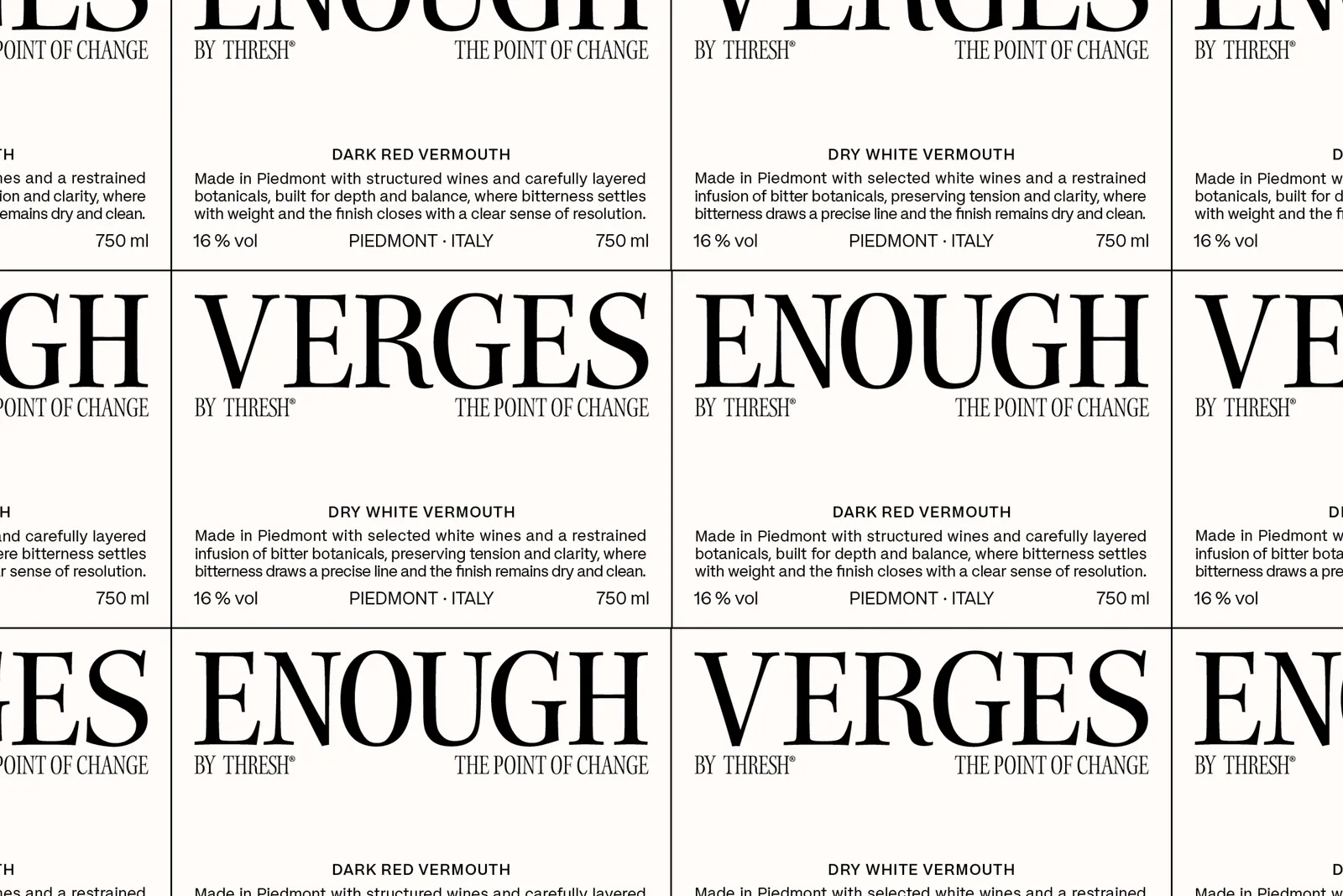
The brand is shaped by two archetypes, the Ruler and the Sage, representing control, discernment, and clarity. Its identity takes
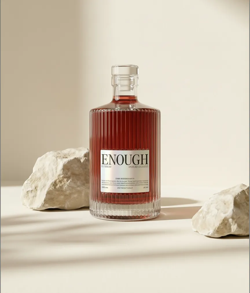
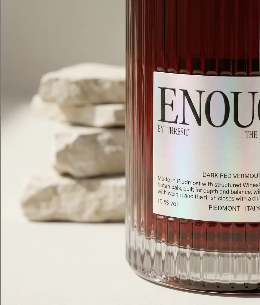
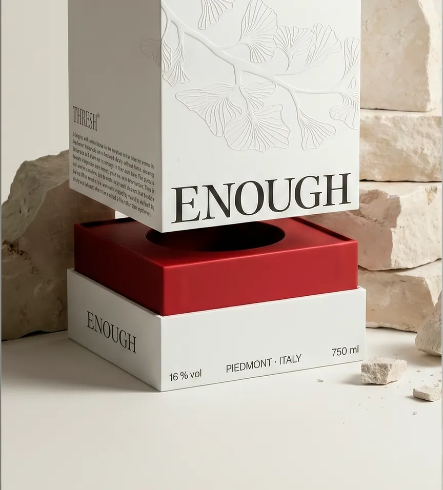
form through two complementary products: Blanco Seco — Edge,
a precise and lucid pause, and Rojo Oscuro — Enough, a deeper
and more definitive ending.
The name THRESH refers to the threshold as a point of decision. Rather than focusing on celebration or ritual, the brand presents vermouth as a conscious gesture to stop, reclaim your time,
and regain control of your own rhythm.
Brief me
Something.
chavescerrejon@gmail.com
[ Get in touch ]
Please feel free to contact me
to discuss your project.
I’ll make it sharper.
 Schedule A Call


