Fernet Branca
With an accent of its own
This project reimagines Fernet Branca through the lens of Argentine culture, celebrating how the country has transformed an Italian product into a distinctive social ritual. The objective was to create
a unique identity for the locally produced version, preserving
its heritage while giving it a voice of its own.
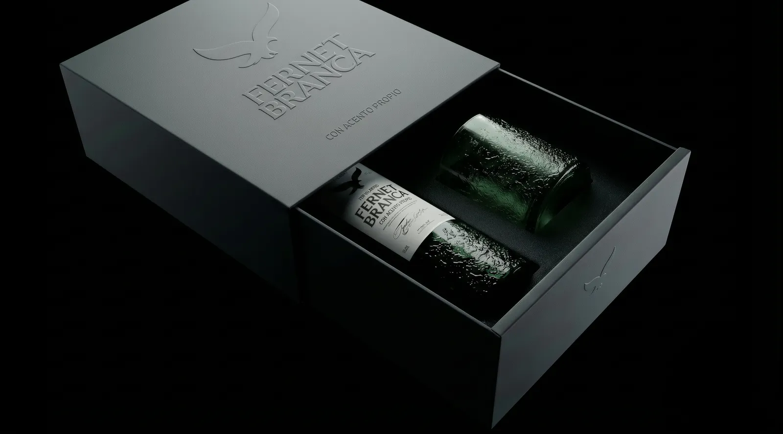
The proposal includes a redesign of the bottle, label system,
and visual identity, combining embossed glass, refined typography, and a minimalist aesthetic to create a more contemporary expression of the brand. The concept, Con Acento Propio, highlights the cultural identity of Argentine Fernet, positioning it as more than a drink:
a symbol of connection, tradition, and shared moments.
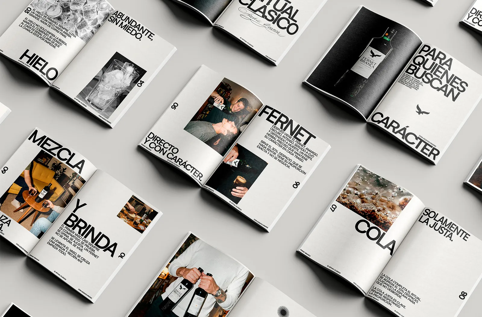
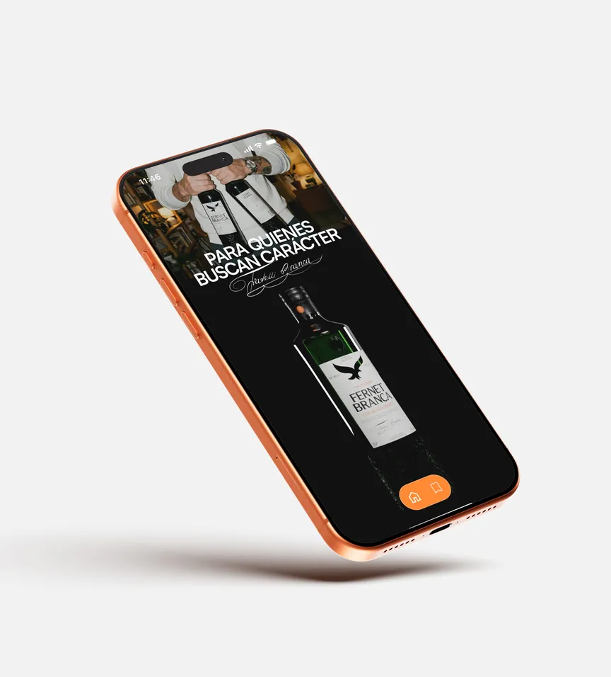
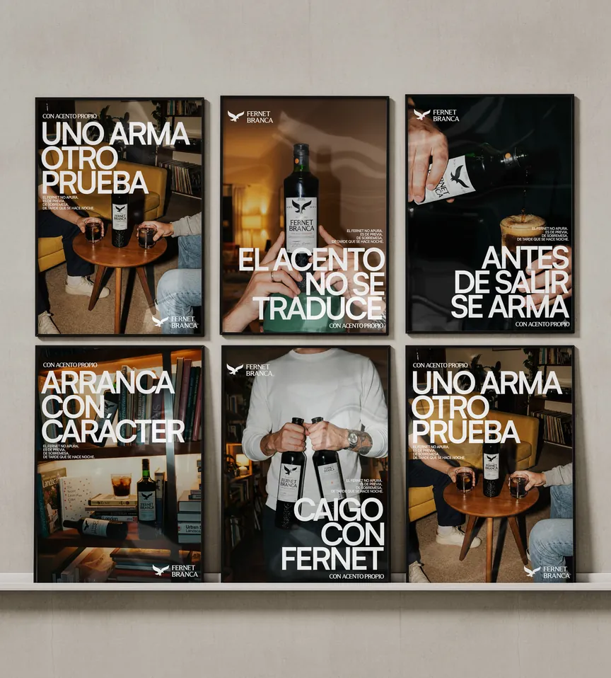
The project extends into a communication strategy and campaign
art direction inspired by everyday rituals, from gatherings before going out to conversations after dinner. Through branding,
packaging, product design, and photography, the project creates
a cohesive brand experience that connects Fernet’s Italian origins with contemporary Argentine culture, celebrating the people
and moments that make it unique.


Brief me
Something.
chavescerrejon@gmail.com
[ Get in touch ]
Please feel free to contact me
to discuss your project.
I’ll make it sharper.
 Schedule A Call


